|
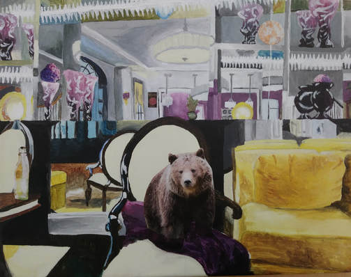
5. I chose Helen's amazing painting in her artists style. I believe that it goes above and beyond with the assignment. Helen's artist used mirrors and magazine clippings in his pieces and so she did. But she added her own humor to it by adding the bear. I can tell Helen had a fun time making this piece because every time I looked over I saw giggling about what to put in her painting. At one point I think she wanted to put some people peaking over the chair. I love how she payed so much attention to the detail of the shading and the highlights because the shading on the couch looks so real and the highlights on the chair and the vases are outstanding. Also I just noticed this but the paint gets lighter around the big chandelier to make the illusion of it being lit. Overall I think Helen did a great job with matching her artists style.
https://hjulianart.weebly.com/projects.html |
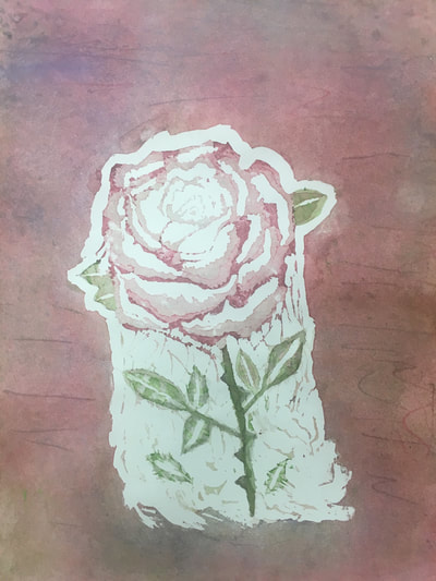
2. The piece on the left is my piece of a painting painting which is where I got a section of a painting and was told to recreate it. I feel like I have grown with being detailed in my pieces and matching the colors that I need. Also I feel like I have grown by using more techniques like adding texture along with highlights and shading. Usually when I paint I am very meticulous about how I do everything but with some of this painting I just dove right in and it turned out well so I feel like that is a great thing to grow in. The piece on the right is my watercolor project which is where I used masking fluid to make highlights and outlines and I poured different colors onto my painting. With this piece I feel like I grew a lot creativity wise by adding texture and layers on the flowers and the spiderweb concept I was going for. I also feel like I have grown with this piece technique wise too because the masking fluid is very interesting and I plan on using it more in other pieces. Going along with technique I love the hue that I have done with the petals and I would have never thought that would be something I could do in the the beginning of the year.
|
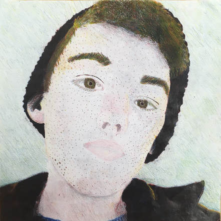
7. I feel like this was my most unsuccessful piece. For this piece I was suppose to recreate a photo of me with only red, blue, and yellow. I believe I followed directions okay but it doesn't look the best. Lets start off with how my looks really light and doesn't look like skin. Also my hair does not have any blonde in it at all so I don't know why there is blonde in the hair. Then there's my eyes, they are two different sizes, and my eyebrows are like blocks. I do however like the beanie and from my chin down because of the highlights and the shading. But then I have what looks like a bruise that was supposed to be shading on my neck. I think overall next time I would go a little bit darker on the skin tone and darken up the highlights a bit too at the top of my hair.
|
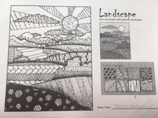
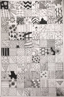
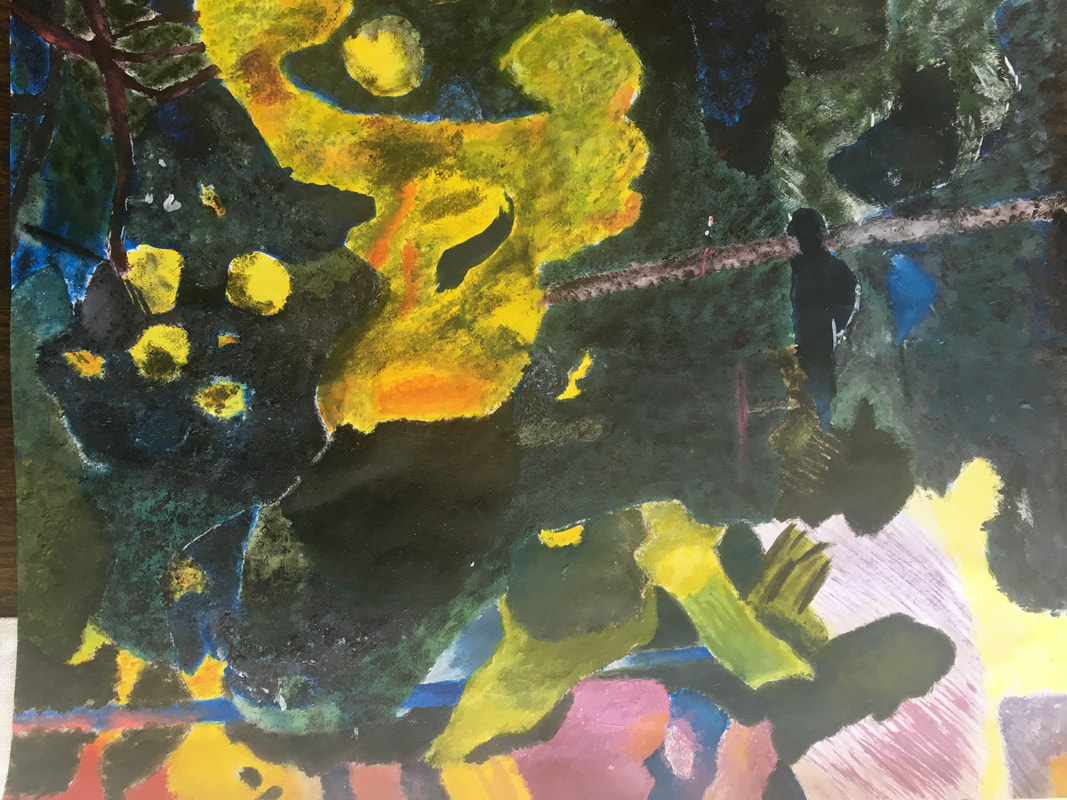
4. These mini lessons were beneficial to my pen and ink project because they helped with patterning. The one on the right was made to help come up with 100 different pattern ideas which I would later use in my project. These patterns had to be creative and original in order to make the project look better. The one on the left was designed to take the patterns from the one on the right and make them flow with a landscape. As you can see mine does not flow as well as others but it did help me understand how to do it. In my project I used some of those patterns that ended up flowing well and it payed off. I feel like I did not need more instruction for success because it is pretty self explanatory to add patterns to your piece with value. I do have to say making the value flow was hard because we didn't really get that much to practice for that. Overall these lessons did prepare me for my project well.
