|
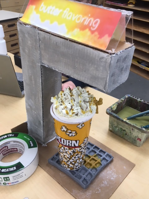
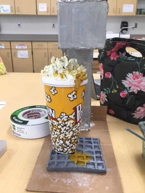
1. My sculpture is not the neatest because the drain is not exactly square and the popcorn could be neater. I think it looks well executed for the most part.
2.The most difficult part of this project was the popcorn because it took forever to make and I could never get them right. 3. Yes my colors worked well together because none of the colors were too bright or to dark that my butter wouldn't show up. 4. My sculpture is interesting from all views because it is painted from all sides and all of the detail is there. The only part that is not is the popcorn because it is a little bit smaller than the cup so there is a little bit of a gap. 5. With 2D you don't have to make sure that it perfect from all sides but with 3D it's different because each little piece of my popcorn had to be placed just right. 6. I created texture in my sculpture by using a needle tool to ruff up the surface of my popcorn. 7. My sculpture to me does look like actual food and I accomplished this by getting all of the paint the right color and making sure the popcorn was the right shape and size. 8. If I were to do this project again I would make the popcorn a little bit smaller and I would add more highlights to the butter to make it the kind of see through that it has. I would also make my drain more square and neater.
0 Comments
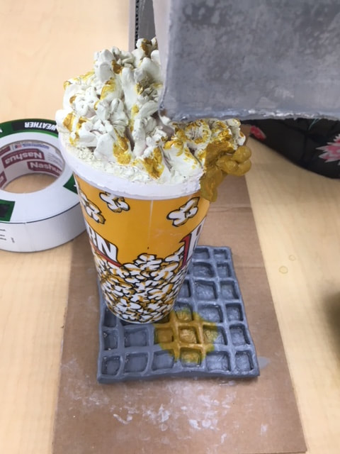
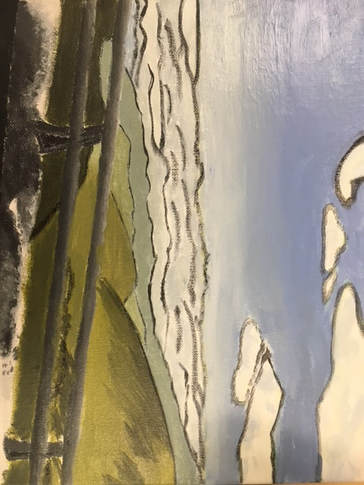
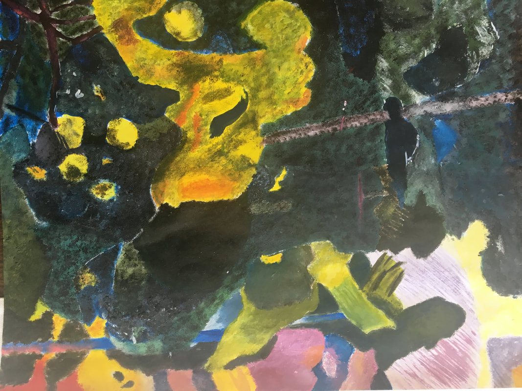
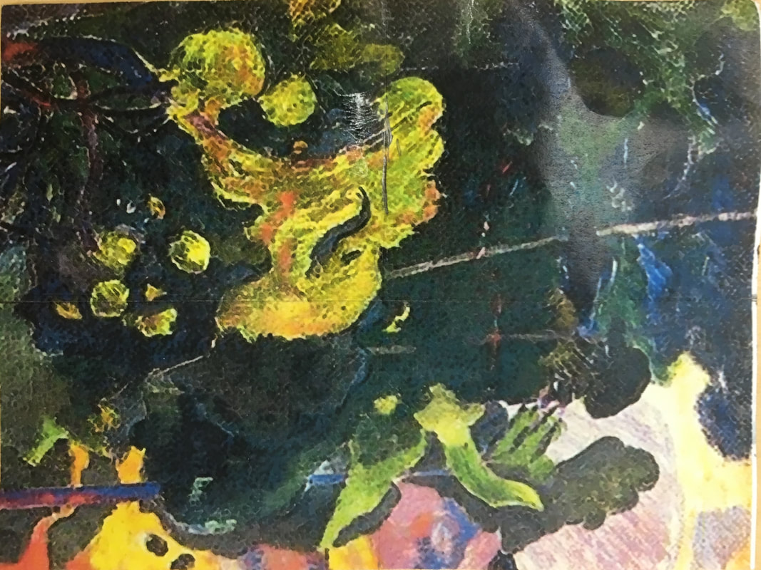
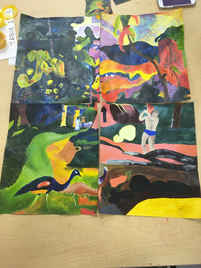
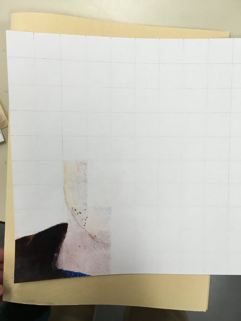
For this assignment we were given a section of a painting and were asked to paint the exact same thing. First I divided my picture, which you can see in the middle, into four sections. That helped me figure out where the bigger parts of the painting were placed. I then started on the bottom right and then the bottom left and then the top right and the top left. I felt like in order to get the texture of the painting I needed to add splotched black paint. This process took a lot longer than it needed to and I took a little to much time on the details. I feel like I did a good job on my piece except that it's a little too light but overall I feel like I did a great job with matching the painting.
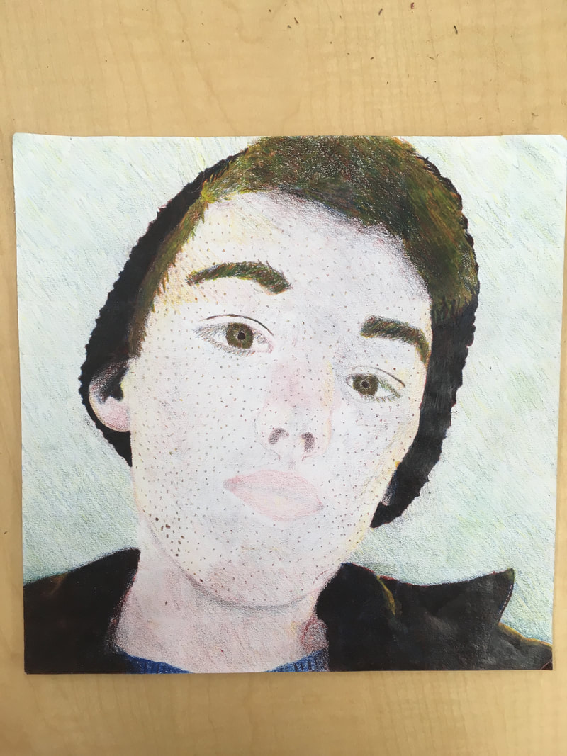
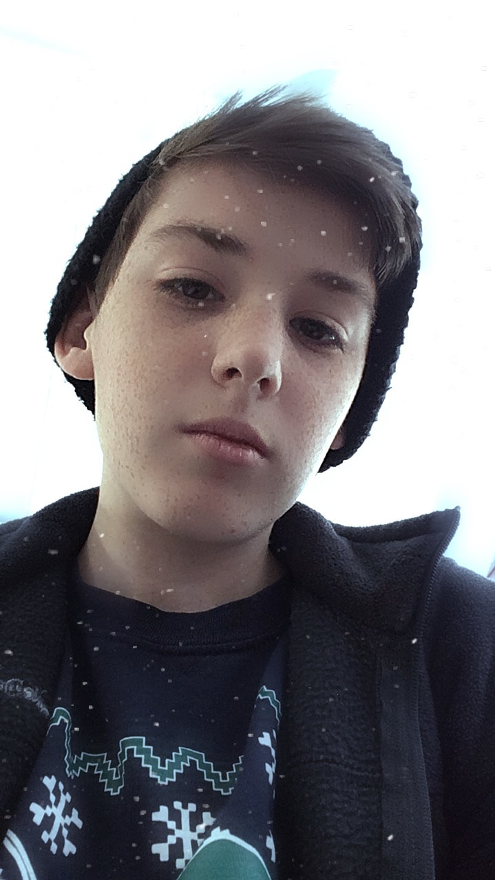
1. I believe my portrait is neat except my freckles because they aren't placed like normal freckles would be, instead they're placed randomly and evenly around my face.
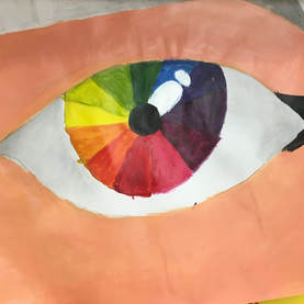
2. I had the most difficulty with the blending of the hair because it was either too red or too yellow because of mixing the brown. 3.Yes I followed the directions to not draw and do it box by box, until I got to the freckles because i didn't know how to do them. It is important to do it box by box because it makes you get value in each box before you move on to the next one. 4. I created value with my colored pencils by using blue to shade and yellow to highlight. 5. For me to get black I started soft with red and then layered with blue and then got thicker with the layers. For brown I started with red and added blue and yellow and got thicker as I added value. For the skin I started soft with red and used yellow softly and blue softly for value. 6. I could improve it by making the skin darker because it makes me look like a ghost wearing fake eyebrows, hair, and a jacket. 7. I feel like I was partly prepared for the project because the prismacolor shapes helped with blending and highlights and shadows but I think we needed to do something with griding. 8. I love Amaya's piece because all her shading and all her colors were perfect it looked amazing and so realistic especially with the highlights in the hair. For this assignment I made 3 prismacolor shapes and used lighter and cooler colors to make value. I used white to make to a highlight and used black to make a shadow. I blended these colors together by starting out with one color and then overlaying the next one slightly and then repeating the process until it becomes smooth and I can't go over it any more.
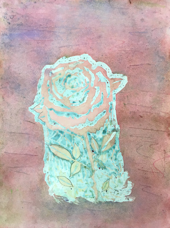
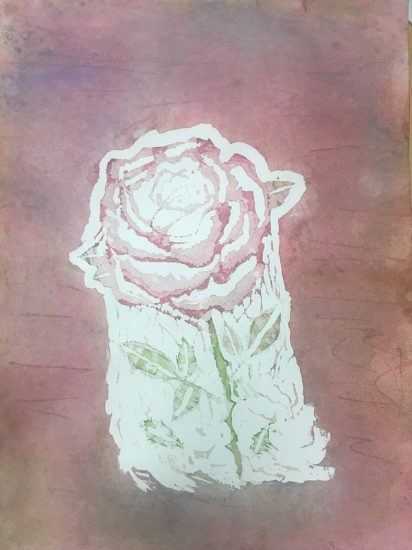
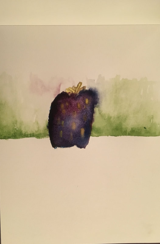
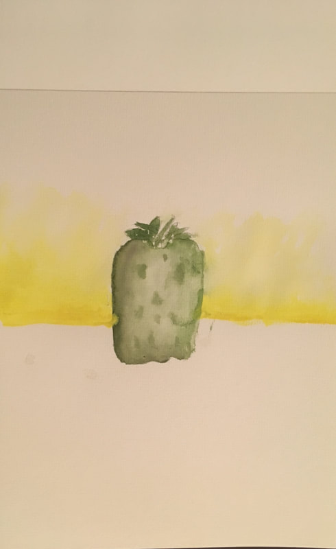
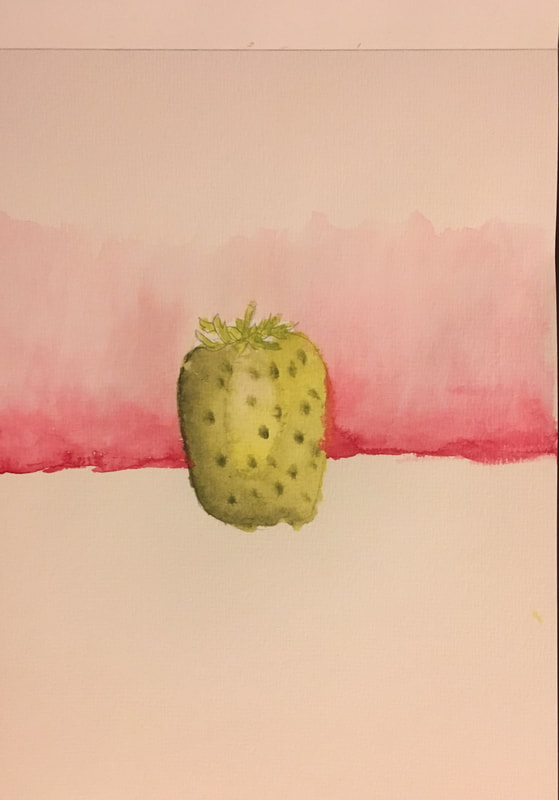
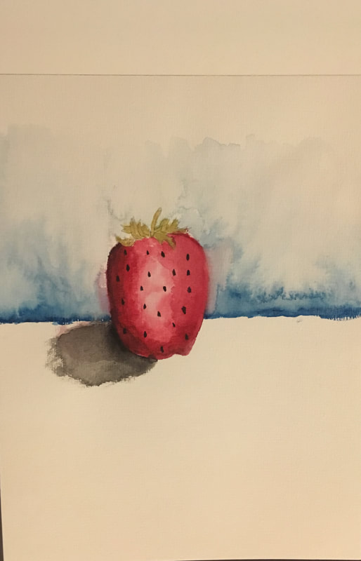
2. Describe any difficulties you had with this process. 2. The most difficult part for me was keeping the color I wanted on the paper because the more red and green I put on the browner it got. 3. What were 4 things you learned from this project? 3. I learned that I need to patient with this process or it can ruin the whole thing. Also, I learned how to layer colors. Also, I learned how to use masking fluid to highlight. Finally I learned to add value to pouring watercolor pieces. 4. What would you do differently if you were to do this project again? 4. I would definitely add more to the picture. 5. How did you use layers, textures, and color to create a successful piece? 5. I used the paint bottle to scratch up the paper to make texture and I used masking fluid to layer the color on the petals. 6. Do you feel that the mini watercolor lessons were beneficial to you learning more about watercolor? Explain. 6. Yes but no. Yes because I learned how to make value and texture with normal watercolor. No because It didn't really apply to pouring watercolor. 7. Was having a guest artist a positive experience? Explain. 7. Yes because he was really nice and he showed me what to do and what not to do. 8. What did you learn from the guest artist that gave you more insight into being a professional artist? 8. He told us what not to do based off his past experiences of his pieces. For this I used watercolor to paint a strawberry with different tones and values. I first started drawing the strawberry and then painting in the berry and then the background. I thought that my last one was the most successful but I thought all the backgrounds and highlights were successful. If I were to do this again I would use different colors and I would make sure that none of the color bleed into each other. I think this exercise will help me in the final project by doing value with only one or multiple very similar colors together.
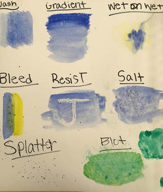 I showed different watercolor techniques on the sheet. I first did a wash, then gradient, then wet on wet, then bleed, then resist, then salt, then splatter, and finally blot. During the wash I started light and got darker. During gradient I started dark and then used water to work my way down. During wet on wet I put a drip of watercolor on a water droplet. During bleed I put blue down and then yellow partly on the blue so it bleeds over. During resist I used wax and white crayon and painted over it. During salt I painted watercolor and pinch salt on top. During splatter I put paint on my brush and brushed the bristles of the brush. During blot I painted on layers of watercolor and used a paper towel to spread the paint.
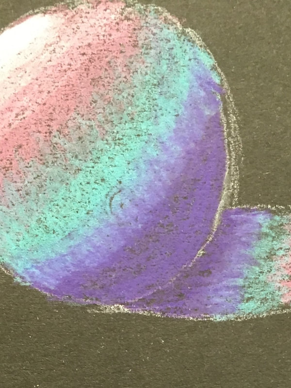
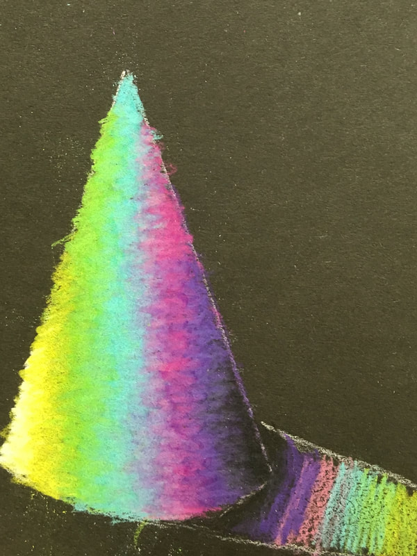
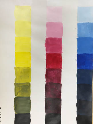
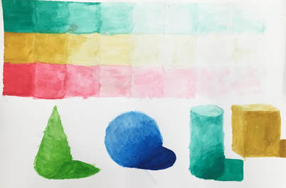 In this assignment I used blue, yellow, and red to create value charts. I feel like I did good with the color getting lighter but I didn't really do a good job with the brush strokes and the cleanliness of them. At bottom I did a sphere, cube, cone, and cylinder with value and shadows. I know threw this that I need to work on my brush strokes. This practice will help me with value threw this unit.
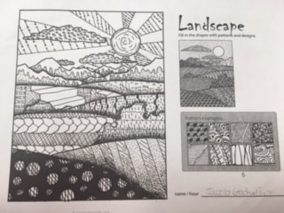 We used patterns from our 100 textures sheet to create value in the landscape.This was hard because all the patterns had to rap around the landscape.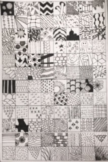 I made 100 texture squares with different patterns that might be used for our final project. This definitely harder than I thought at the beginning because after a while I started running out of ideas. |
JacobI love to be creative and use my imagination. Archives
June 2018
Categories |
 RSS Feed
