|
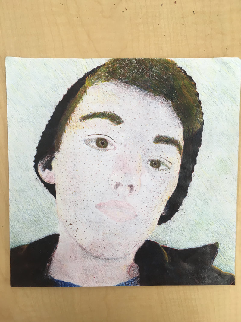
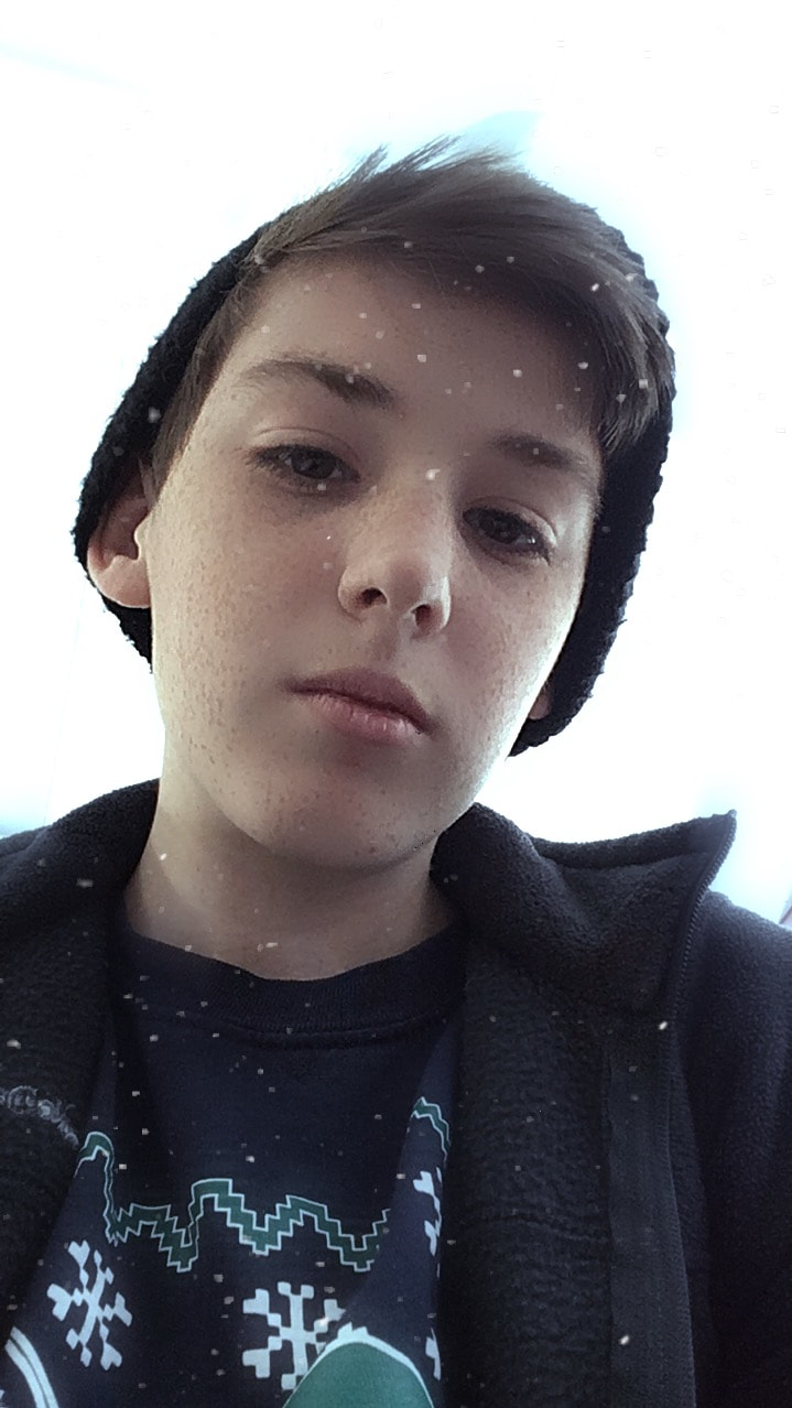
1. I believe my portrait is neat except my freckles because they aren't placed like normal freckles would be, instead they're placed randomly and evenly around my face.
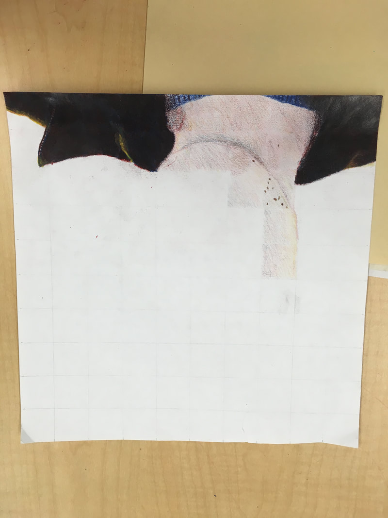
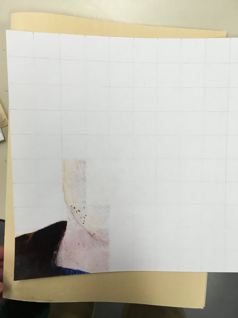
2. I had the most difficulty with the blending of the hair because it was either too red or too yellow because of mixing the brown. 3.Yes I followed the directions to not draw and do it box by box, until I got to the freckles because i didn't know how to do them. It is important to do it box by box because it makes you get value in each box before you move on to the next one. 4. I created value with my colored pencils by using blue to shade and yellow to highlight. 5. For me to get black I started soft with red and then layered with blue and then got thicker with the layers. For brown I started with red and added blue and yellow and got thicker as I added value. For the skin I started soft with red and used yellow softly and blue softly for value. 6. I could improve it by making the skin darker because it makes me look like a ghost wearing fake eyebrows, hair, and a jacket. 7. I feel like I was partly prepared for the project because the prismacolor shapes helped with blending and highlights and shadows but I think we needed to do something with griding. 8. I love Amaya's piece because all her shading and all her colors were perfect it looked amazing and so realistic especially with the highlights in the hair.
0 Comments
Leave a Reply. |
JacobI love to be creative and use my imagination. Archives
June 2018
Categories |
 RSS Feed
